1 Introduction
Hi there! This post is a modification of the final project I did for my Time Series class and the idea is simple: fit an ARIMA model and make a forecast. To do so in R we can use auto.arima() function from {forecast} package or we can decide what model are we going to fit and why. We will choose the latter path :)
Here we are going to explore how the number of domestic air passengers in Argentina has evolved in the last years, fit a model to the data, and forecast the number of domestic passengers for the next twelve months.
Before starting we will load all the libraries needed:
# required libraries
library(dplyr)
library(astsa)
library(knitr)
2 The data
The data was taken from “Tablas de Movimientos y Pasajeros EANA 2014 - 2018”, a report from Empresa Argentina de Navegacion Aerea. It can be accessed via the following link: https://www.eana.com.ar/estadisticas#informes
NOTE: The curious reader will note that the data file available now on EANA’s website is different from the one I will work with. When I started this project, the data file available was this. At some point between August 2018 and December 2018 they changed the file including more years and modifying the numbers.
The data set I used for my project contains a lot of information about airline passengers and flights in Argentina for the period 2014 - 2018. We will concentrate on the number of domestic airline passengers for the 54 months between January 2014 and June 2018.
The data is presented as an xlsx file and it is displayed in a way that it is hard to import in R. Hence, before importing it, I pre-cleaned it using Microsoft Excel. You can access the pre-cleaned version here.
# import csv file
df <- read.csv("/home/jm/blog/static/passengers_ts.csv",
               header = TRUE)

# remove year and month
dat <- df %>%
  select(-c(year, month))

# create time series object
dat <- dat %>%
  ts(start = c(2014, 1), end = c(2018, 6), deltat = 1/12)
2.1 First analysis: time plot
The first step in the analysis is to make a plot of the original data, where the number of domestic passengers is taken as the response variable and the time (months) as the explanatory variable. To do the plot we just use the function plot.ts()
# original data time plot
plot.ts(dat[ , 1],
        ylab = "thousand passengers",
        main = "Domestic air passengers in Argentina 2014 - 2018")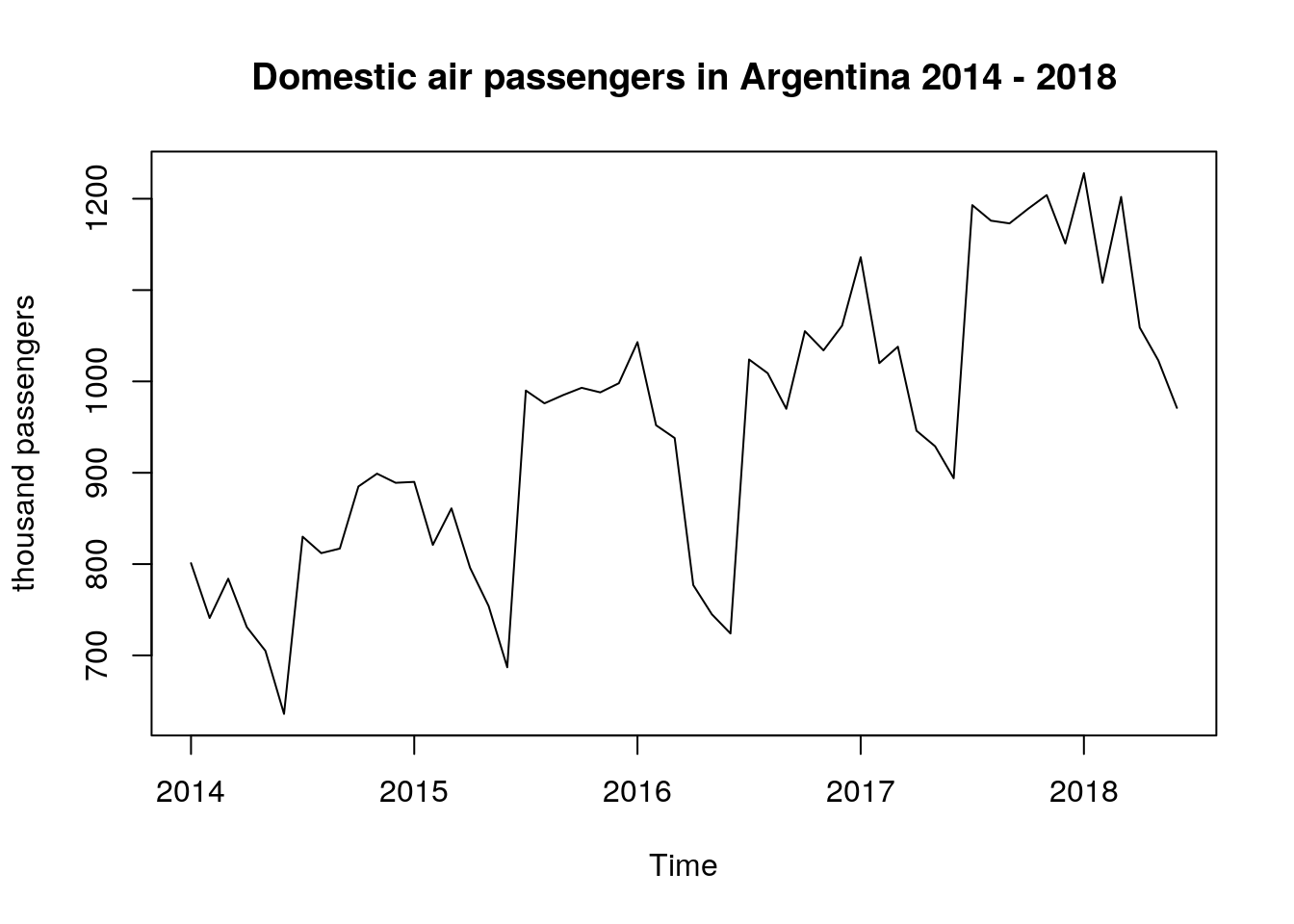
The time plot above is showing that the data presents an upward trend and the variability is not constant over time. Because of these two facts, we can claim that the weak stationarity conditions are not met and, additionally, it seems that there is a seasonal behaviour of the underlying process.
Before fitting a model we will need to do some work on this data: i) variance stabilization transformation and ii) trend removal.
3 Transformations
3.1 Variance stabilization transformation
Why do we want to stabilize the variance?, you may be wondering. Well, the problem with non-constant variance (a.k.a heteroscedasticity) is that, as time grows, small percent changes become large absolute changes. And we don’t want that in our model.
So, in order to stabilize the variance, we took the natural logarithm of the original data and will store the transformed data in log_dat
# log transformation
log_dat <- log(dat[ , 1])
plot.ts(log_dat,
        ylab = "log thousand passengers",
        main = "Domestic air passengers in Argentina 2014 - 2018")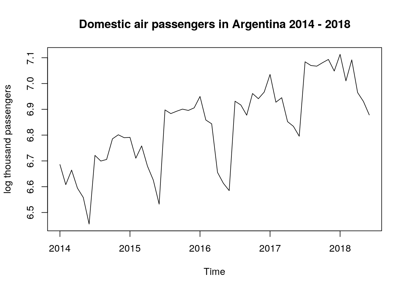
This plot looks very similar to the first, but the range of the dependent variable is considerably smaller (pay attention to the values on the y-axis).
3.2 Trend removal
On the first time plot we observed an upward trend that can be removed by differencing the data. Besides the time plot, one can use the ACF to determine if differencing is needed before fitting a model.
In this section, we will use the acf2() function from {astsa} package, which plots the ACF and PACF values for different lags.
Note: In the x-axis for the ACF and PACF plots below, the integer numbers represent years. In between two integers there are twelve marks in the x-axis, one for each month of the year.
# correlation structure
log_acf <- acf2(log_dat,
                max.lag = 30,
                main = "log thousand passengers")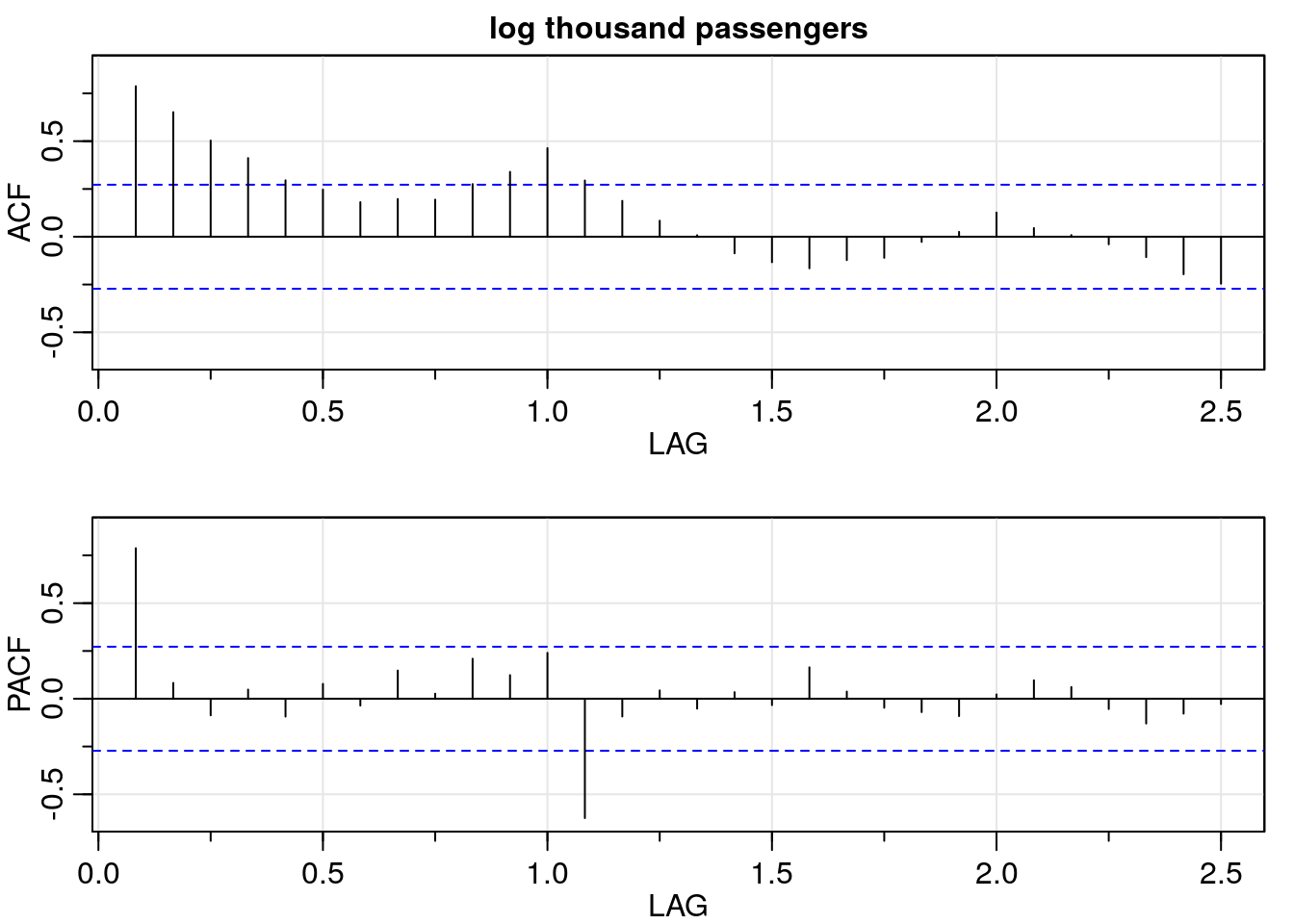
As we see in the ACF plot above, it presents a slow decay as the lag increases. This supports our initial hypothesis that difference is needed.
3.2.1 Non-seasonal differentiation
Here we will difference the transformed data (log_dat) and repeat the ACF and PACF analysis using acf2().
# differentiation
dlog_dat <- diff(log_dat, lag = 1)
dlog_acf <- acf2(dlog_dat,
                  max.lag = 45,
                  main = "(Non seasonal) differenced log thousand passengers")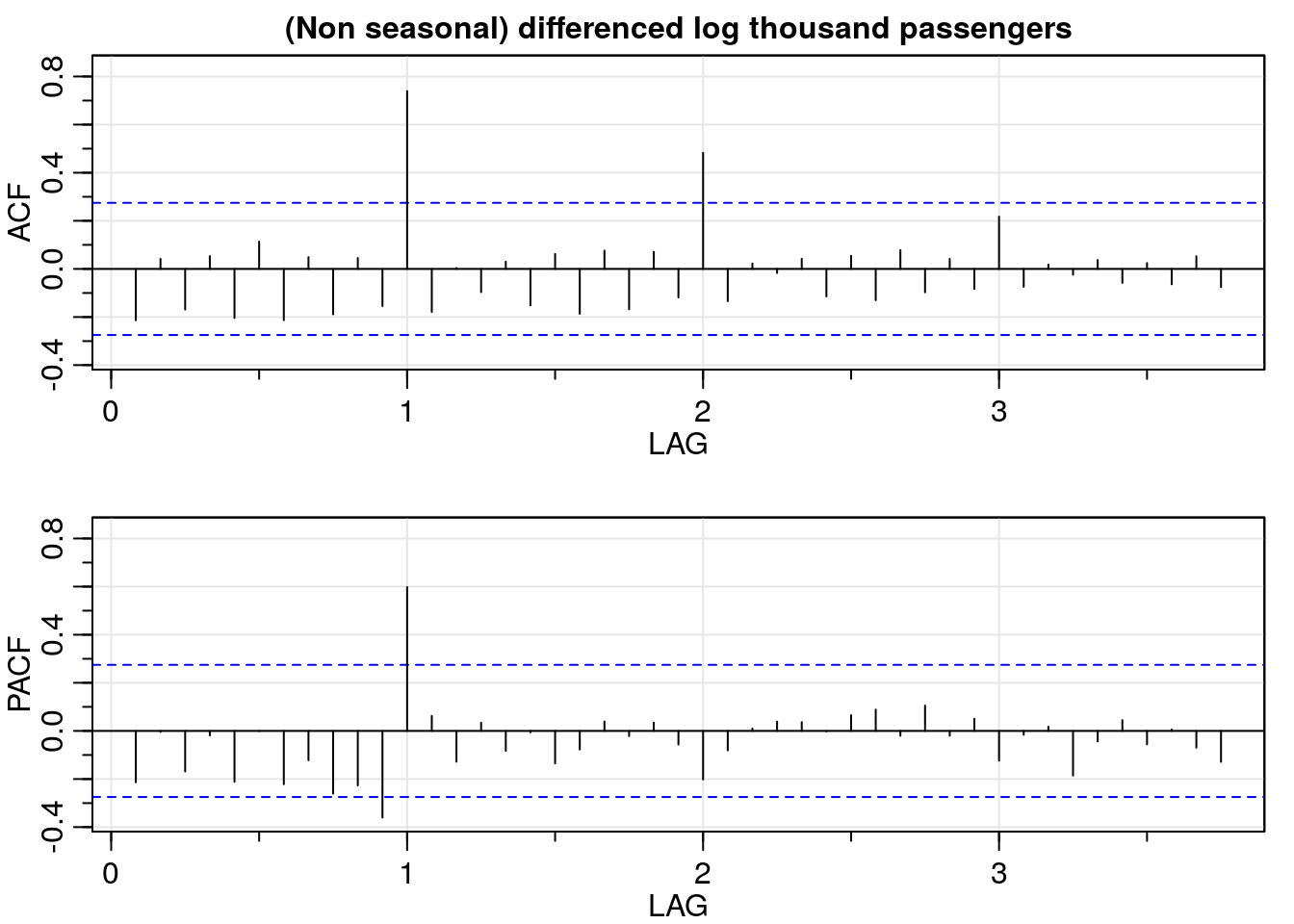
Beautiful, isn’t it? Be careful though, non-seasonal differencing removes only one part of the correlation. In the ACF plot above we still observe seasonal correlation for \(12 * k\) for \(k = 1, 2, \ldots\).
In plain English, this is telling us that the number of air passengers of a certain month is related to the number of passengers for the same month in previous years. That is, the number of passengers in January 2018 is related to the number of passengers in January 2017, and so on.
Since the ACF tails off for \(12 * k\) for \(k = 1, 2, \ldots\) and PACF cuts off after lag 1, a seasonal autoregressive component of order one is needed.
Additionally, the following time plot of the non-seasonal differenced log data also helps in the analysis: we observe how the peaks and valleys repeat every twelve months.
# time plot of non seasonal differenced data
plot.ts(dlog_dat,
        ylab = "log thousand passengers",
        main = "(Non seasonal differenced) log thousand passengers")
abline(h = 0, lwd = 1.5)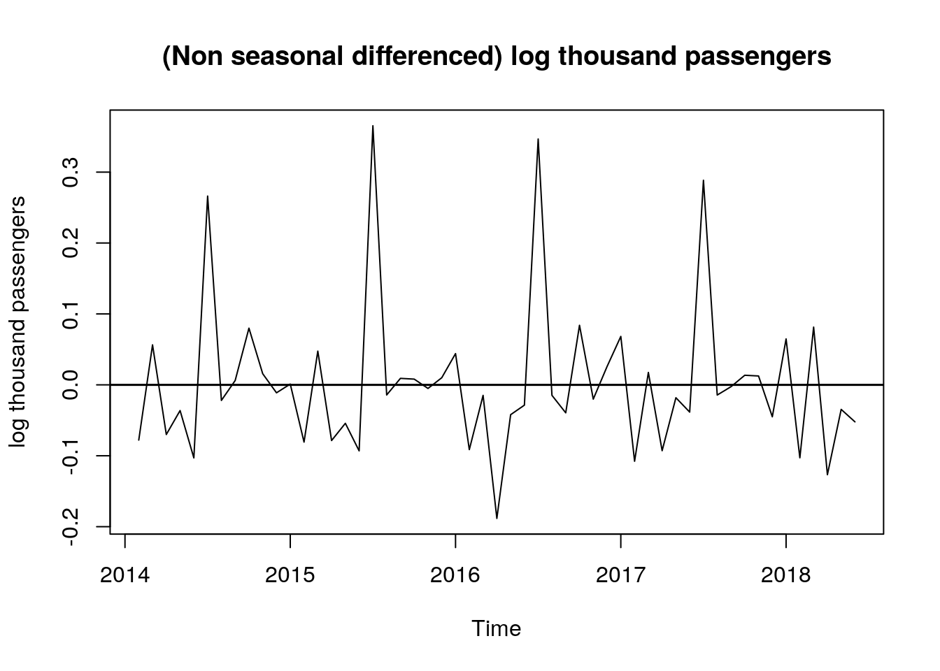
3.2.2 Seasonal differentiation
Now we will remove the seasonal correlation. To do this we use again the function diff(). Note that this time lag = 12: we are telling R to difference observations that are 12 months apart. This will perform:
- January 2018 - January 2017
- February 2018 - February 2017
- March 2018 - March 2017
So on and so forth. Once we took seasonal differentiation, the ACF values lie between the blue dashed lines; meaning that the autocorrelation function is not significantly different from zero.
# seasonal and non seasonal differenced log data - ACF/PACF
ddlog_dat <- diff(dlog_dat, lag = 12)
ddlog_acf <- acf2(ddlog_dat,
                   max.lag = 35,
                   main = "(Seasonal and non seasonal) differenced log thousand passengers")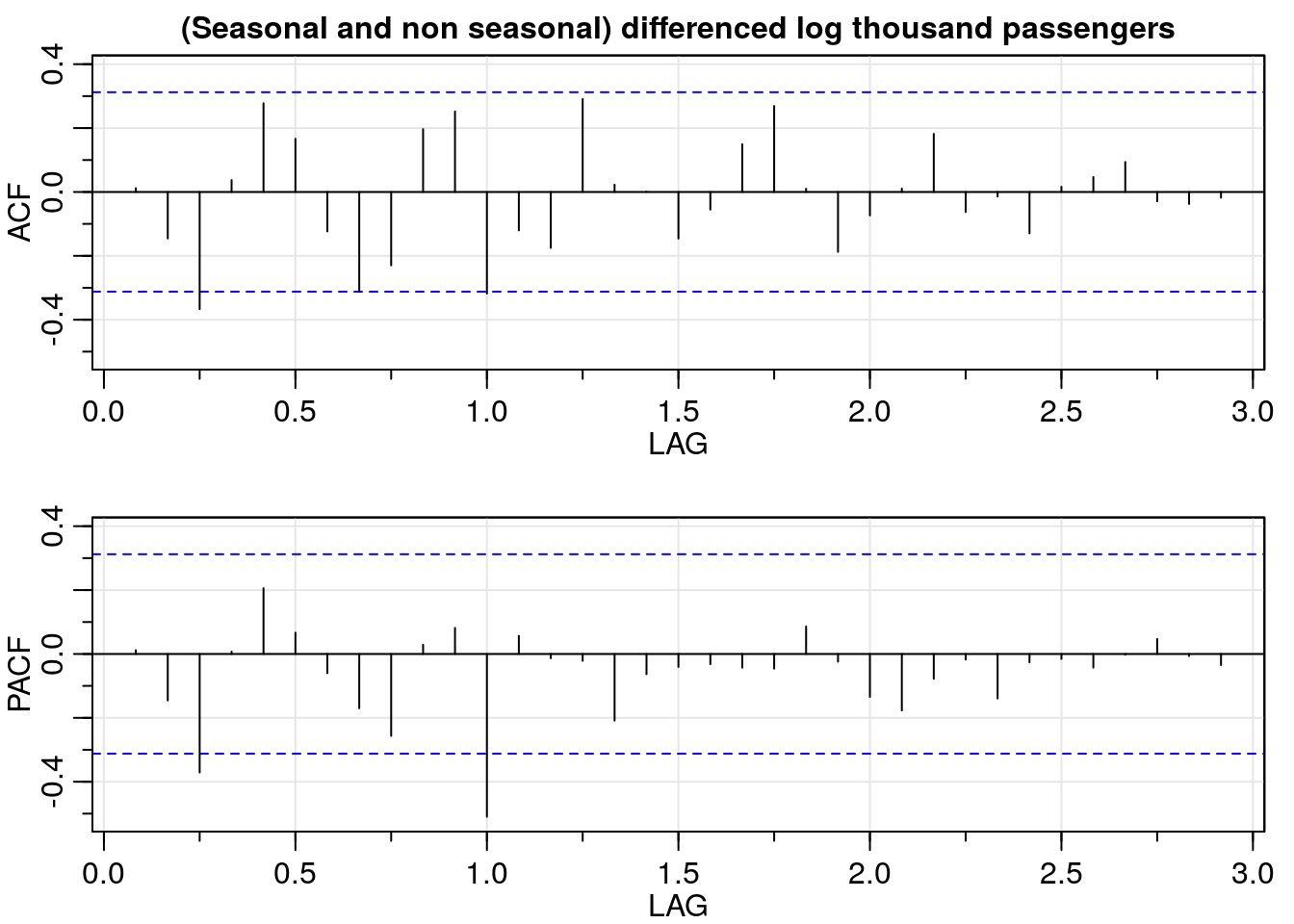
3.3 Stationary data
Finally, we make a time plot of the transformed and differenced data and it shows that now the process seems to be stationary:
# seasonal and non seasonal differenced log data - time plot
plot.ts(ddlog_dat,
        type = "l",
        ylab = "log thousand passengers",
        main = "(Seasonal and non seasonal) differenced log thousand passengers")
abline(h = 0, lwd = 1.5)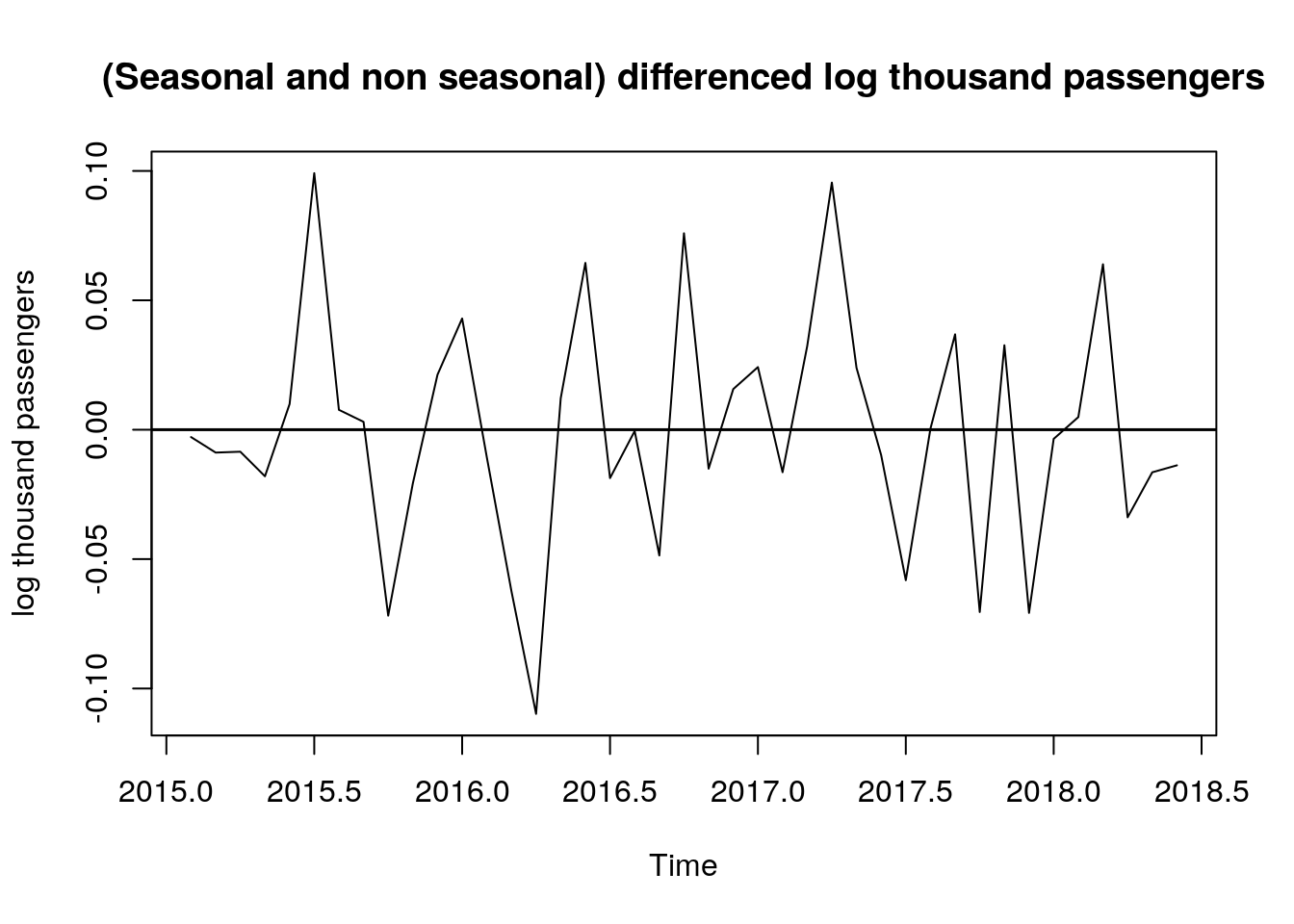
4 Model fitting and cross-validation
Now that we have analyzed our data, and decided which transformations we are going to apply, we are going to select the model with cross-validation (CV). However, the cross-validation procedure that we are going to apply with time series data is a little bit different to what we usually do with independent data. If you want to read about CV for time series I recommend here, here, and here.
Why do we need cross-validation?. The answer is that we don’t want to test our models with the same data used to train them; that would be an overly optimistic scenario. Instead, we want to test our model on unseen data.
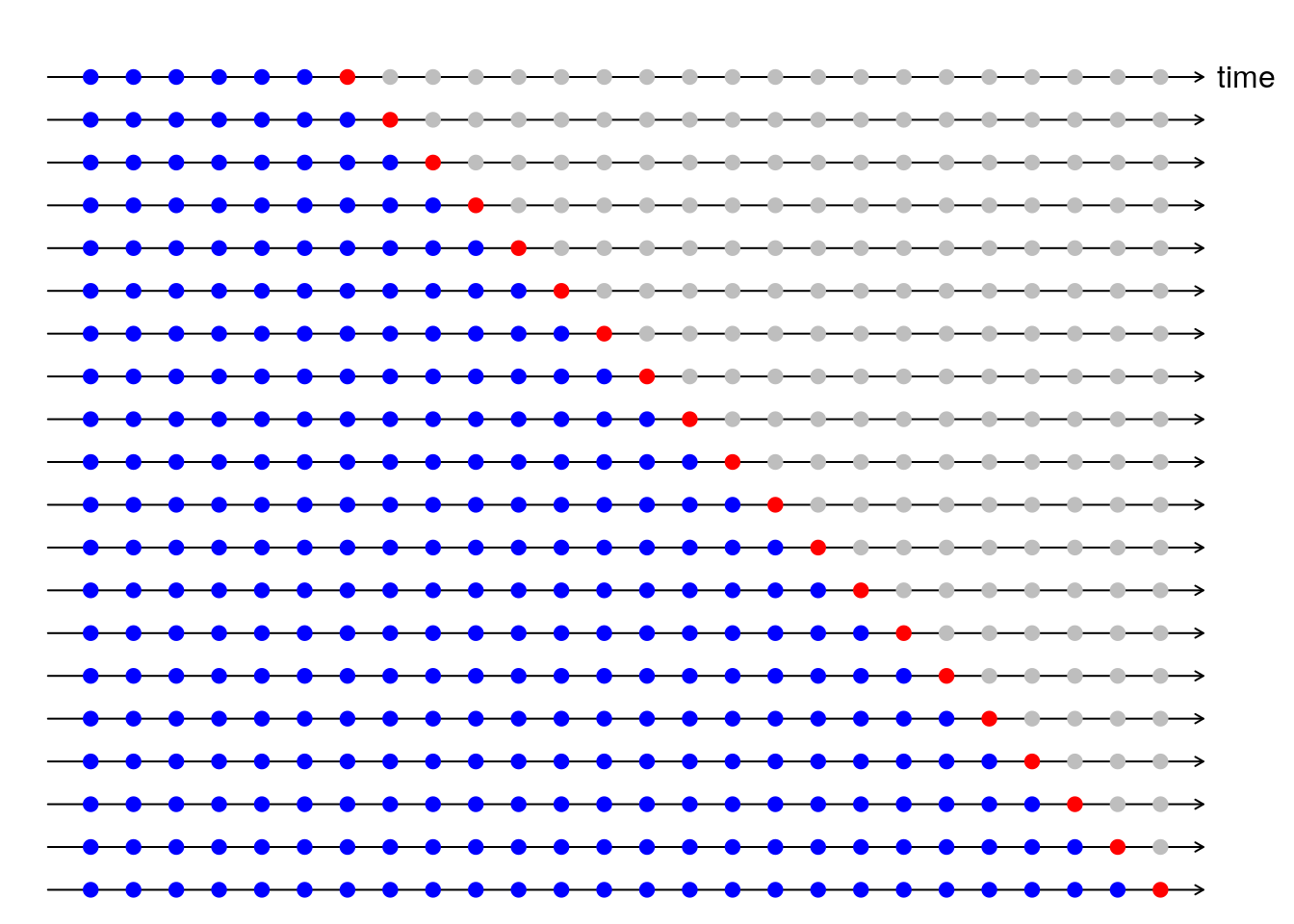
A graphic representation of this process is shown in Rob J Hyndman’s blog post (I reproduced the plot below) and he also provides the code to make it here.
Starting with 36 of our 54 months we are going to:
- Fit a model on a train set (blue dots),
- Make a prediction for the test set (red dot),
- Compute the error and square it,
- Increase training data by one and repeat the process.
(If we try to start with less than 36 months, the arima() function returns an error). Finally, we are going to average all the squared errors getting what is known as Mean Squared Error (MSE).
Using the analysis of the previous sections and the CV validation procedure explained above, here we will fit two models to the log-transformed data using the function arima(). The objective of fitting two models is to identify whether or not a moving average component is needed. This is not really clear in the ACF/PACF and time plots analysis we made before, so we will fit one model with q = 1 and one with q = 0 and then compare the MSE values from CV.
The models we are going to fit are:
model_1: ARIMA(p = 1, d = 1, q = 1, P = 1, D = 1, Q = 0, S = 12)
model_2: ARIMA(p = 1, d = 1, q = 0, P = 1, D = 1, Q = 0, S = 12)
################################################################################
# CV for model 1
################################################################################
i <- 36
MSE1 <- c()

while(i < length(log_dat)){
  # train the model with i observations
  m1 <- arima(log_dat[1:i],
              order = c(1, 1, 1),
              seasonal = list(order = c(1, 1, 0), period = 12),
              method = "ML")
  # predict observation i + 1
  y_hat <- predict(m1, n.ahead = 1)
  # prediction MSE
  MSE1 <- c(MSE1, (log_dat[i + 1] - y_hat$pred)^2)
  # increase i
  i <- i + 1
}

# untransform data: back to the original scale
exp(mean(MSE1))
## [1] 1.001494################################################################################
# CV for model 2
################################################################################
i <- 36
MSE2 <- c()
while(i < length(log_dat)){
# train the model with i observations
m2 <- arima(log_dat[1:i],
order = c(1, 1, 0),
seasonal = list(order = c(1, 1, 0), period = 12),
method = "ML")
# predict observation i + 1
y_hat <- predict(m2, n.ahead = 1)
# prediction MSE
MSE2 <- c(MSE2, (log_dat[i + 1] - y_hat$pred)^2)
# increase i
i <- i + 1
}
# untransform data: back to the original scale
exp(mean(MSE2))## [1] 1.001469The MSE obtained with CV is slightly better for model 2. (We look for smaller values of MSE).
Now we are going to use the function sarima() from package {astsa}. This function is basically a wrapper of arima(), but additionally it returns an object called ttable that has the results of t-tests performed on each of the coefficients. The ttable is also printed in the summary of the model. Using sarima() from {astsa} package:
Model 1
# model_1 fitting
m11 <- sarima(log_dat,
              p = 1, d = 1, q = 1,
              P = 1, D = 1, Q = 0, S = 12,
              details = FALSE)
m11
## $fit
##
## Call:
## stats::arima(x = xdata, order = c(p, d, q), seasonal = list(order = c(P, D,
## Q), period = S), include.mean = !no.constant, transform.pars = trans, fixed = fixed,
## optim.control = list(trace = trc, REPORT = 1, reltol = tol))
##
## Coefficients:
## ar1 ma1 sar1
## 0.7151 -1.0000 -0.3902
## s.e. 0.1192 0.0872 0.1470
##
## sigma^2 estimated as 0.001388: log likelihood = 74.45, aic = -140.91
##
## $degrees_of_freedom
## [1] 38
##
## $ttable
## Estimate SE t.value p.value
## ar1 0.7151 0.1192 6.0006 0.0000
## ma1 -1.0000 0.0872 -11.4716 0.0000
## sar1 -0.3902 0.1470 -2.6545 0.0115
##
## $AIC
## [1] -2.709764
##
## $AICc
## [1] -2.700149
##
## $BIC
## [1] -2.577951Model 2
# model_2 fitting
m22 <- sarima(log_dat,
              p = 1, d = 1, q = 0,
              P = 1, D = 1, Q = 0, S = 12,
              details = FALSE)
m22
## $fit
##
## Call:
## stats::arima(x = xdata, order = c(p, d, q), seasonal = list(order = c(P, D,
## Q), period = S), include.mean = !no.constant, transform.pars = trans, fixed = fixed,
## optim.control = list(trace = trc, REPORT = 1, reltol = tol))
##
## Coefficients:
## ar1 sar1
## 0.0898 -0.4209
## s.e. 0.1583 0.1548
##
## sigma^2 estimated as 0.001608: log likelihood = 72.53, aic = -139.05
##
## $degrees_of_freedom
## [1] 39
##
## $ttable
## Estimate SE t.value p.value
## ar1 0.0898 0.1583 0.5671 0.5739
## sar1 -0.4209 0.1548 -2.7194 0.0097
##
## $AIC
## [1] -2.674133
##
## $AICc
## [1] -2.669423
##
## $BIC
## [1] -2.5752734.1 Model selection
From the tables above, we can see that the estimates of the coefficients for model 1 are all significantly different from zero; while this is not the case for model 2. In the latter, the p-value for the non seasonal autoregressive coefficient estimate is 0.57 meaning that we fail to reject the null the hypothesis that the coefficient is equal to zero.
Additionally, AICc and BIC values are smaller for model 1, which leads us to prefer model 1 over model 2. There is one step left to conclude if the model is adequate or not: residual analysis. For this analysis I used the following plots:
# residual plot for model 1
plot.ts(m1$residuals,
        ylab = "log thousand passengers",
        main = "Model 1 residuals")
abline(h = 0, lwd = 1.5)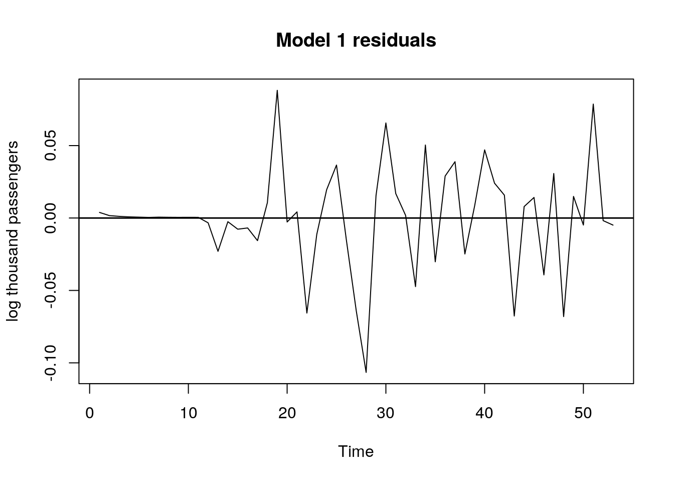
# ACF/PACF for model 1 residuals
res_acf <- acf2(m1$residuals,
                max.lag = 30,
                main = "ACF for model 1 residuals")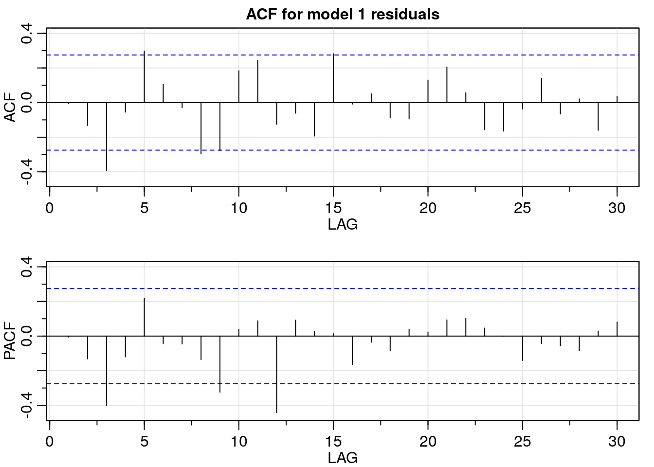
In the time plot of the residuals for model 1, they seem to be uncorrelated. Furthermore, the ACF/PACF values are not significantly different from zero; except for the PACF values corresponding to lag three, nine, and twelve. This result suggests the possibility that there is still some slight seasonal regularity in the residuals, but the addition of another seasonal autoregressive component does not improve the results.
To wrap up, the selected model is model 1:
# coefficients estimates
m1$coef
## ar1 ma1 sar1
## -0.1251408 0.2365606 -0.4286284# coefficients' standard error
sqrt(diag(m1$var.coef))## ar1 ma1 sar1
## 0.5888534 0.5596424 0.15683495 Forecast
For the forecast we can use sarima.for() from package {astsa}, but it automatically prints a plot of the forecasted values.
I wanted to show how to do the plots instead, so we are going to use the predict() function to get the forecast. However, the m11 object we fitted with sarima() function is not going to work here, so in order to use the predict() function we are going to use the m1 model that we created with arima() function.
Note that the arguments of predict() are the name of the model and the forecast scope. Since our data is monthly, we will set n.ahead = 12 to predict a whole year.
# fit the m1 model with all the observations available
m1 <- arima(log_dat,
            order = c(1, 1, 1),
            seasonal = list(order = c(1, 1, 0), period = 12),
            method = "ML")
Forecast for the next year using predict() and model m1:
# forecast
m1_for <- predict(m1, n.ahead = 12)
6 More plots: Original data + forecast
Finally, we are going to plot the original data and our forecast. To do so we start by creating a data frame with the values of interest.
# final values
f_values <- data.frame("Year" = c(rep(2017, 6), rep(2018, 6)),
                       "Month" = c("Jul", "Aug", "Sep", "Oct", "Nov", "Dec",
                                   "Jan", "Feb", "Mar", "Apr", "May", "Jun"),
                       "Forecasted_Passengers" = round(exp(m1_for$pred), 2))

## forecast plots
# past data
t <- 1:66

plot(t, rep(NA, 66),
     ylim = c(600, 1500),
     xlab = "t [months]",
     ylab = "thousand passengers",
     main = "Train data and forecaseted passengers")

grid(lty = 1, col = gray(0.9))

lines(t,
      c(df[1:54, 3], rep(NA, 12)),
      lwd = 2,
      type = "l")

# add forecasted values
lines(t, c(rep(NA, 53), df[54, 3], f_values$Forecasted_Passengers),
      lwd = 2,
      col = "red")

# legend
legend(x = "bottomright",
       legend = c("Train", "Forecast"),
       col = c(1, 2),
       pch = c(16, 16),
       bty = "n")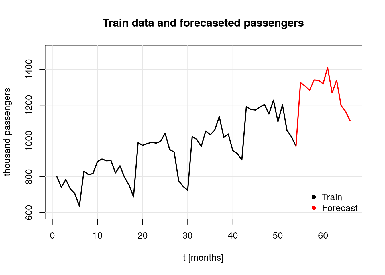
Since the data taken to run the forecast was the log-transformed data, it is required to untransform the data to present the results. Such values are displayed in the next table:
| Year | Month | log_Air_Passengers | Air_Passengers |
|---|---|---|---|
| 2018 | Jul | 7.19 | 1325.93 |
| 2018 | Aug | 7.18 | 1307.09 |
| 2018 | Sep | 7.16 | 1283.27 |
| 2018 | Oct | 7.20 | 1340.69 |
| 2018 | Nov | 7.20 | 1338.72 |
| 2018 | Dec | 7.18 | 1319.26 |
| 2019 | Jan | 7.25 | 1409.66 |
| 2019 | Feb | 7.15 | 1269.25 |
| 2019 | Mar | 7.20 | 1339.67 |
| 2019 | Apr | 7.09 | 1197.56 |
| 2019 | May | 7.06 | 1165.04 |
| 2019 | Jun | 7.01 | 1112.37 |
Note: The unit of passengers in the original data set is thousands, so the number 1000 in the table corresponds to 1000000 passengers.